All of our templates were designed to prominently feature your site's logo. By default, we will use your site name to generate a text-based logo, but you may choose to edit the text or upload a custom logo. If you choose to use a custom logo, we have sizing guidelines for each template.
Text-based Logo
The default logo for your site will be a text-based logo pulled from your site name. If you’d like to edit the text, follow these steps:
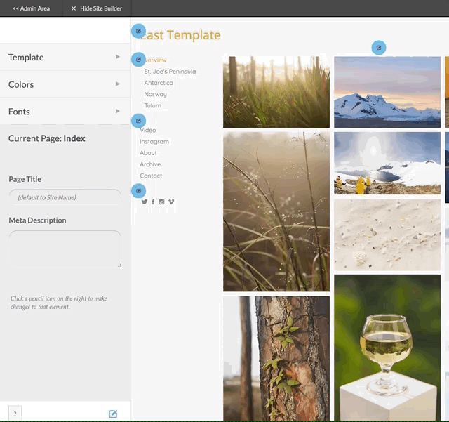
1. Enter the Site Builder from the Design & Customize page.
2. In the Site Builder, click the blue edit icon that says “Logo” when you hover over it.
3. On the left, add your desired logo text to the “Loto text/ALT tag” field.
4. Click the green “Save” button.
Custom Logo
1. Prepare your custom logo file. You can review our sizing guidelines for each template below.
2. Head to your Image Browser and create a new gallery to house your logo. We recommend placing it in the "Unlisted" tab, and titling it something like "logo" or "website assets." The gallery must have a visibility of "Everyone" to ensure the image you place inside it can be publicly viewed.
3. Upload your logo file into the new gallery.
5. Click the blue edit icon that says “Logo” when you hover over it.
6. On the left, click the “Type” drop-down menu and choose “Image.”
7. From the pop-up that appears, double-click either “Listed” or “Unlisted” to begin searching for your logo from that section of your Image Browser. (If following the steps above, you'll go straight to Unlisted here.)
8. Find the gallery you created to store your logo and double-click to open it.
9. Find your logo file and click "Select Image."
10. Click the green “Save” button before exiting this section of the Site Builder.
Logo Guidelines per Template
HiDPI-Ready Image Logos
To accommodate the high pixel density of HiDPI displays, images must be available at a larger size than is necessary for a non-HiDPI device. In the case of your image-based logo on PhotoShelter, the file size used on an HiDPI display is exaactly 2x bigger than its non-HiDPI counterpart -- this ensures a high-quality, consistent delivery experience across display types.
You can upload a logo file up to 2040px on the image’s longest side, though the exact size you’ll want to make it will depend on the template you’re using. Please see the section below for more detailed size recommendations and other information specific to each template.
If you do not have a large version of your image logo (meaning that it would not look passable when displayed at half of its original size), you may choose to disable HiDPI/Retina support for your logo. This way, it will display at its original size on non-HiDPI displays, though its quality will be compromised on non-HiDPI displays. It's up to you whether this risk is worth it, but as HiDPI displays will only increase in number over time, we strongly recommend future-proofing your portfolio by obtaining a larger version of your logo.
Please note the "HiDPI (Retina) support" setting in the below screenshot. To access your Logo Settings, open your Site Builder, and click the pencil icon next to your site's logo.
Please note that in the interest of image quality, we will never upscale your logo, so it will never display at a size larger than it was uploaded to PhotoShelter.
Template Guidelines
Please note that the maximum logo size across all templates is 2040px on the image's longest side. If you have the HiDPI (Retina) support disabled, the following size recommendations do not apply.
Element
- Square logos are recommended for this template. To optimize for mobile viewing, keep important text elements large and brief.
- The ideal dimensions can vary based on your logo file, but a good place to start would be to set the logo width to 432px.
- When your site loads, we calculate the screen size and set a maximum width at which your logo may display; this way, space is shared optimally between your logo, navigation, and images
Downtown, Pivot, Sonnet & Shuffle
- Many different logo shapes and sizes will look nice on these templates
- These templates have more flexibility with logo display; main content area is not affected by the logo's size/position
East
- Horizontal logos are recommended for this template. A 9:1 aspect ratio would be a good starting point.
- Recommended minimum logo height: 75px
- When your site loads, we calculate the screen size and set a maximum width at which your logo may display; this way, space is shared optimally between your logo, navigation, and images
Horizon
- Horizontal or square logos are recommended for this template
- Recommended minimum logo height: 80px
- When your site loads, your logo will be displayed at half its uploaded height
Marquee
- Horizontal logos are recommended for this template
- Recommended minimum logo height: 144px
- When your site loads, we do a behind-the-scenes calculation to determine whether there is sufficient width to display both your logo and your site's navigation
- If, after the logo fills the available width, there isn't enough room for all navigation items to display, the nav is automatically collapsed under a menu ("hamburger" icon)
- This same approach applies to text logos, though the size of the text is fixed (i.e. not presently scaled to fit the space, as image logos are)
Promenade
- Horizontal logos are recommended for this template
- Recommended minimum logo height: 136px
- When your site loads, we do a behind-the-scenes calculation to determine whether there is sufficient width to display both your logo and your site's navigation
- If, after the logo fills the available width, there isn't enough room for all navigation items to display, the nav is automatically collapsed under a menu ("hamburger" icon)
- This same approach applies to text logos, though the size of the text is fixed (i.e. not presently scaled to fit the space, as image logos are)